Ownwell: Refinance Monitoring Flow Redesign
Ownwell's refinance flow helped customers understand their mortgage options. However, it was long, generic, and applied to customers regardless of whether refinancing actually made sense for them. I redesigned the flow to be shorter, clearer, and standardized on the new design system I built at Ownwell, which is now being extended to insurance and other flows.
The goal: The goal of this redesign was to lift refinance flow completion from ~51% to 65%+ by making the experience shorter, clearer, and relevant to each customer's actual situation. Beyond the completion metric, the flow needed to surface a higher-qualified customer base — routing people toward refinance, cash-out, or monitoring based on real qualification logic rather than a one-size-fits-all process. Overall, reduce the confusion customers had reported with the previous, longer flow.
The Problem
The existing refi flow was flagged as long and confusing in customer feedback. It didn't differentiate between customers who qualified for a refinance, qualified for a cash-out refinance, or simply weren't in a position to benefit Everyone went through the same lengthy process regardless of fit. Completion sat around 51%.
What I designed
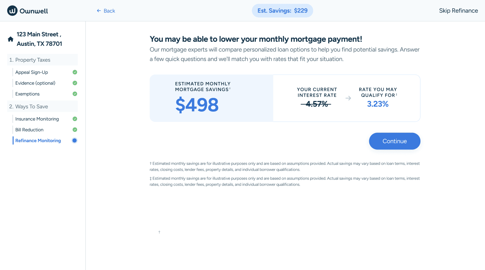
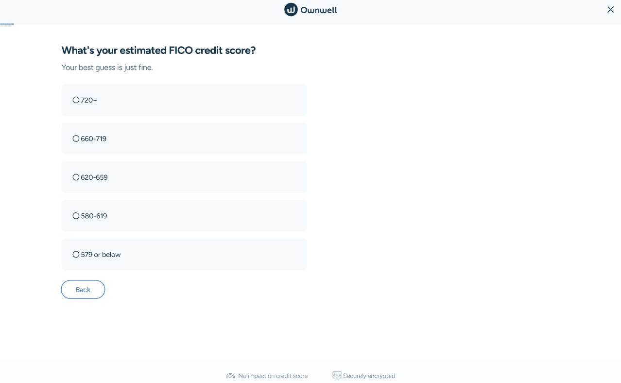
A shorter, decision-driven flow. Rather than walking every customer through the same long process, the redesigned flow asks customers to confirm their mortgage details up front, then routes them to a clear next step based on their actual situation: Refinance, cash-out refinance, or "keep monitoring."
Qualification logic built into the experience. I worked with the team to translate underlying business rules into a clear customer-facing moment:
Customers whose rate is more than 1% above current market rate are guided toward a refinance
Customers with 20%+ equity and a rate at or below market are guided toward a cash-out option
Everyone else is told plainly that monitoring is the right move right now — instead of pushing them through a flow that doesn't apply to them
Consistency across portal and onboarding. The flow works across both surfaces, with a smart portal-specific detail: once a customer has completed the flow once, returning to update mortgage details shows an "Update details" CTA instead of "Continue," with a clear exit (X) option, so that returning customers aren't confused into re-completing a flow they've already finished.
Design system standardization. This was one of the first flows built on the new design system I created at Ownwell that established patterns now being reused across insurance and other product areas.
Results
Flow completion rose from ~51% to ~61% within the first weeks of launch against a target of 65%+ with the redesign continuing to be monitored for further lift as it stabilizes.
Process
I started by digging into the qualification logic product and engineering had outlined such as with rate thresholds, equity requirements, and the different paths a customer could land on.
The, I worked to translate that logic into a flow customers could actually follow without feeling like they were filling out a form for a decision they didn't understand. Rather than trimming the existing flow, I rebuilt it around the decision point itself
To shorten the flow without losing the inputs needed for accurate qualification, I grouped the mortgage-detail questions based on where customers were dropping off and how easy each question was to answer. I aimed to lead with lower-effort, higher-completion fields to build momentum, and grouping harder or more sensitive questions together later so customers weren't front-loaded with friction or asked to context-switch between easy and hard inputs, which kept each screen focused and avoided cognitive overload.
I also used this as an opportunity to standardize the flow on the new design system I'd built at Ownwell, treating it as a proof point for patterns that would later extend to insurance and other product areas.

Designs