
Ownwell: Insurance Policy Comparison
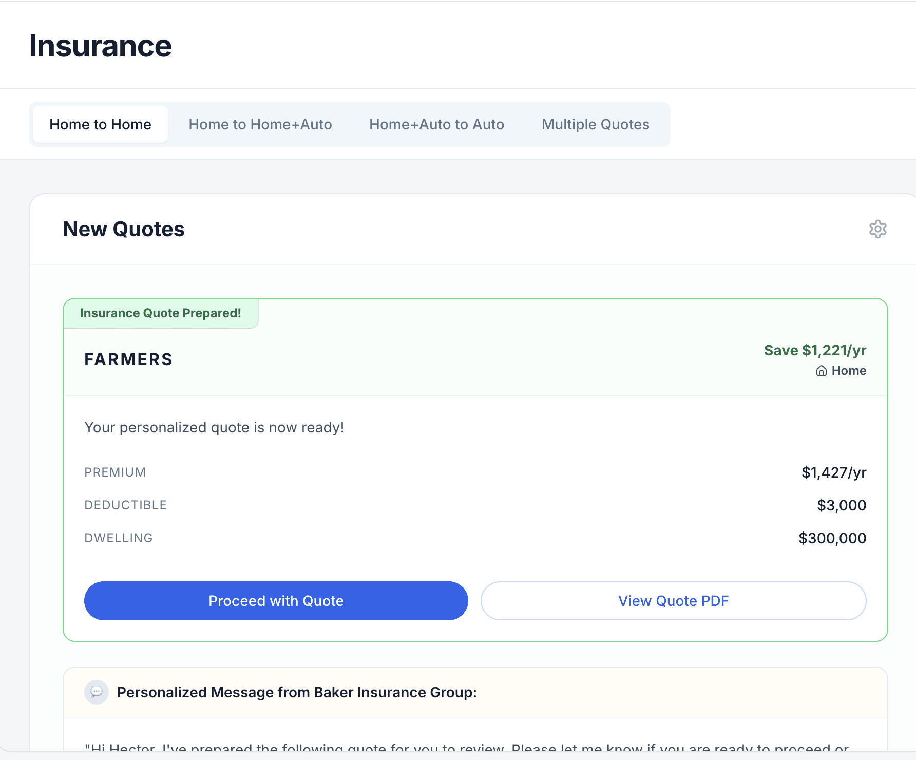
As part of an initiative to launch Ownwell's new quote-ready insurance experience, I led design on the comparison breakdown preview and the full comparison breakout page. Essentially, the moments where a customer sees exactly what they'd save, what's different, and what to do next regarding their insurance policy.
The goal: Provide customers a more clear and detailed view of the insurance quotes being offered to them from a high-level quote details, a real quote-by-quote comparison against their current policy when we have it, as well as a stronger emphasis on the assigned insurance agent so customers know exactly who to contact and when.
The Problem
Customers reaching this stage of the flow were seeing quotes without enough context to act on them confidently. There wasn't a clear comparison against what they already had, the agent relationship felt disconnected from the quote experience, and the system didn't effectively handle the common case where a customer's current policy wasn't on file yet.
What I designed
A quote-state-aware agent card. The assigned agent experience now adapts to where the customer is in the process:
No agent assigned yet → a card that emphasizes what happens next
Agent assigned, no quote yet → an updated "preparing your quote" state
Agent assigned with a quote ready → the agent card minimizes to make room for the full quote comparison experience
A smarter comparison experience. Working alongside the team building the AI-generated "What's Better" and "Things to Note" summaries, I designed the breakdown so customers get an at-a-glance read on how a new quote stacks up — without needing to parse a policy document themselves.
A graceful no-policy-on-file path. When we don't have a customer's current policy to compare against, uploading one launches the same tri-picker pattern already used in the Insurewell analysis flow — keeping the experience consistent rather than introducing a new pattern for the same job.
Consistent, low-risk interaction. All existing CTAs, modals, and status logic carried over unchanged, so the redesign layered in new value without disrupting flows that were already working.
Results
Launched and is live for customers (Results incoming).
Process
Designed from Figma mocks through to a working prototype (built in Magic Patterns) to validate flow logic before handoff.
Collaborated cross-functionally with engineering on the AI comparison endpoint and tooltip copy, using a shared spec sheet to keep terminology consistent across quote states
Part of a larger, phased rollout. Designed to cleanly plug into the existing quote experience.

Designs

